Glitter Hour
This project started as a school package design assignment in Algonquin college’s graphic design program. The piece was a re-make of a product of your choice, where I had to build out and create dye lines. A year afterwards I decided to remake the project into a logo branding guide as a personal project. For this project I used Illustrator and Indesign.
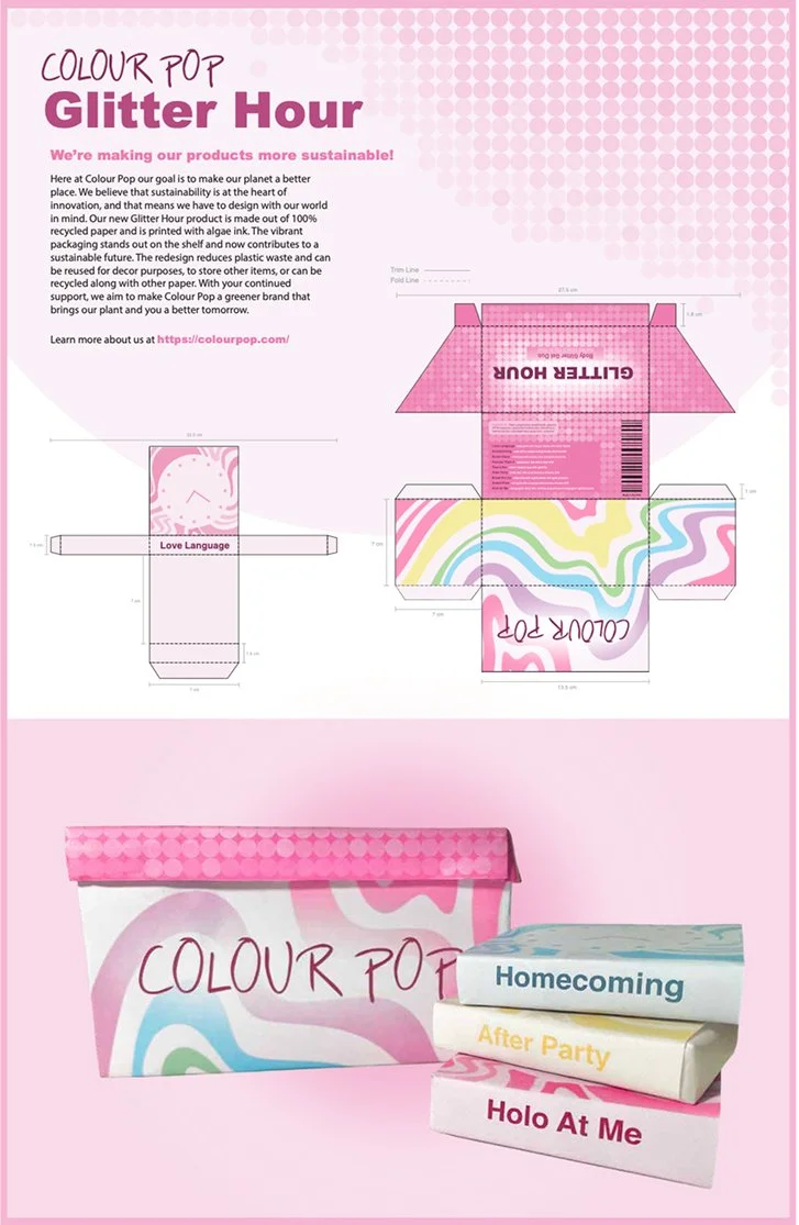
The design problem that was too be fixed with this design was the logo and visual consistency. Colorpop is a well known makeup brand that has a very basic calligraphy logo, something that doesn't stand out as the business itself does. The main requirement I wanted to focus on was the creating a logo that would support the company and push it forward.

My design decisions for the Glitter hour logo branding guide line were to keep the companies whimsical aesthetic while keeping everything accessible and well-read. I wanted to keep the core design that I came up with and improve it with my skills. I wanted to apply what I've learned since I first created the project and make it better. This remodel taught me that I can go back and do over my own work. That I can start over and turn something I didn't love into something I’m proud of.